
The Hidden Cost of One Image for Everything
One image can look efficient until it has to serve every layout, screen size, and social preview at once. The real cost of reusing the same file everywhere is not just larger downloads — it is weaker design decisions and slower pages.
By Cloudy Convert
Practical guides from the Cloudy Convert team on files, formats, privacy, and digital workflows.
The Shortcut That Looks Efficient
Reusing one image is not automatically wrong. It is a reasonable starting point for a small project, a temporary campaign, or an image whose subject survives every crop. The problem begins when convenience becomes the permanent image strategy.
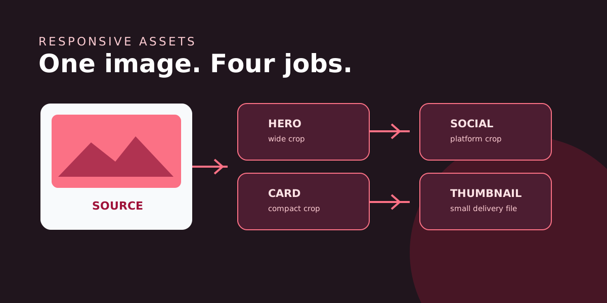
A website does not have one image context. It has a visual system: a wide lead image, compact cards, open graph previews, search results, email headers, and narrow mobile compositions. Each context asks the same source to do a different job.
A smaller file is not the same as the right file
Image optimization has two separate decisions: how much image data to send and what the image needs to communicate in its placement. Compression addresses the first. Cropping, dimensions, and art direction address the second.
Hero
Wide composition, strong focal point, high visual priority.
Card
Short crop, quick recognition, lower display size.
Preview
Readable at a glance when shared outside your site.
The best derivative is not always the smallest one. It is the smallest version that still looks sharp, preserves the subject, and arrives in a format the browser can decode efficiently.
A Practical Responsive Image Playbook
Keep one source of truth. Preserve the original at a sensible quality, then generate derivatives from it instead of editing each exported copy.
Design a small size set. Choose a few widths based on your actual layouts. Three purposeful sizes beat fifteen nearly identical exports.
Change the crop when meaning changes. Use art direction for images where the mobile story is not simply a narrower version of desktop.
Test the rendered result. Inspect the image at its real display size, on a slow connection, and with the surrounding headline visible.
Format and quality are a judgment call
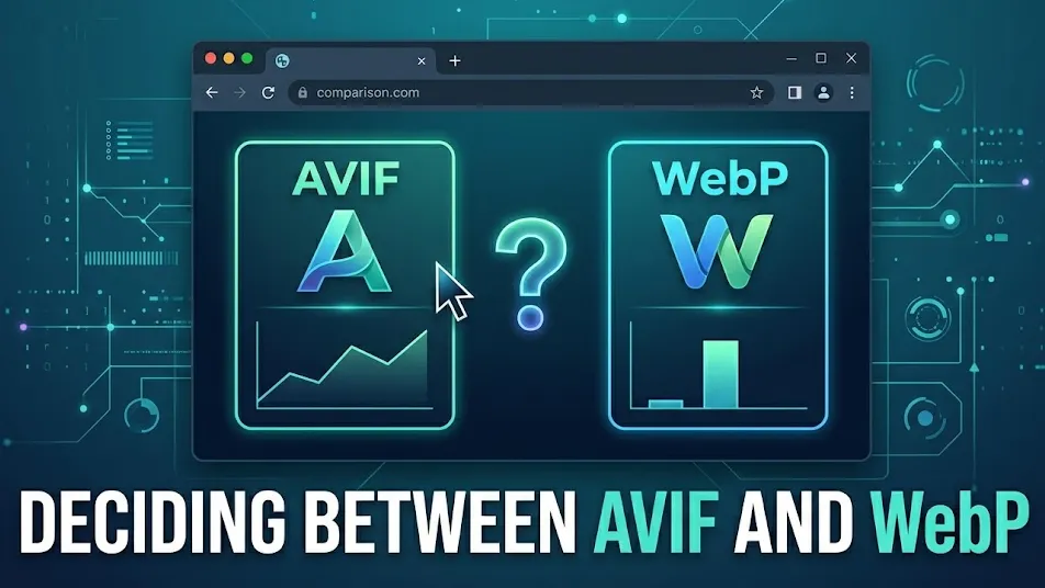
AVIF can be a strong choice for photographs and gradients when its smaller transfer size justifies the encoding cost. WebP is a dependable default with broad support and fast processing. PNG still earns its place for certain lossless graphics, and JPEG remains useful for compatible photographic exports.
Compare, then decide
Export the same image at the same visible dimensions, compare file size, and inspect edges, text, skin tones, and gradients. A format win that introduces visible artifacts is not a performance win.
You can compare these trade-offs locally with Cloudy Convert's image converter, then keep the version that meets both the visual and delivery requirements.
The workflow that scales past the first launch
Treat images as content with variants, not as isolated files sprinkled through a codebase. Give each source a clear name, record where it is used, and create derivatives when a placement has different dimensions or a different message.
This makes redesigns calmer. A new card ratio does not force you to compromise the homepage hero, and a social preview does not inherit a crop designed for a product grid. The extra decisions happen once, close to the source, instead of repeatedly inside every component.